PocketFellow e-Wallet
An Intuitive, Secure, and User-Centered Mobile Payment Experience for Older Adults.
Case Study :
UX/UI Design
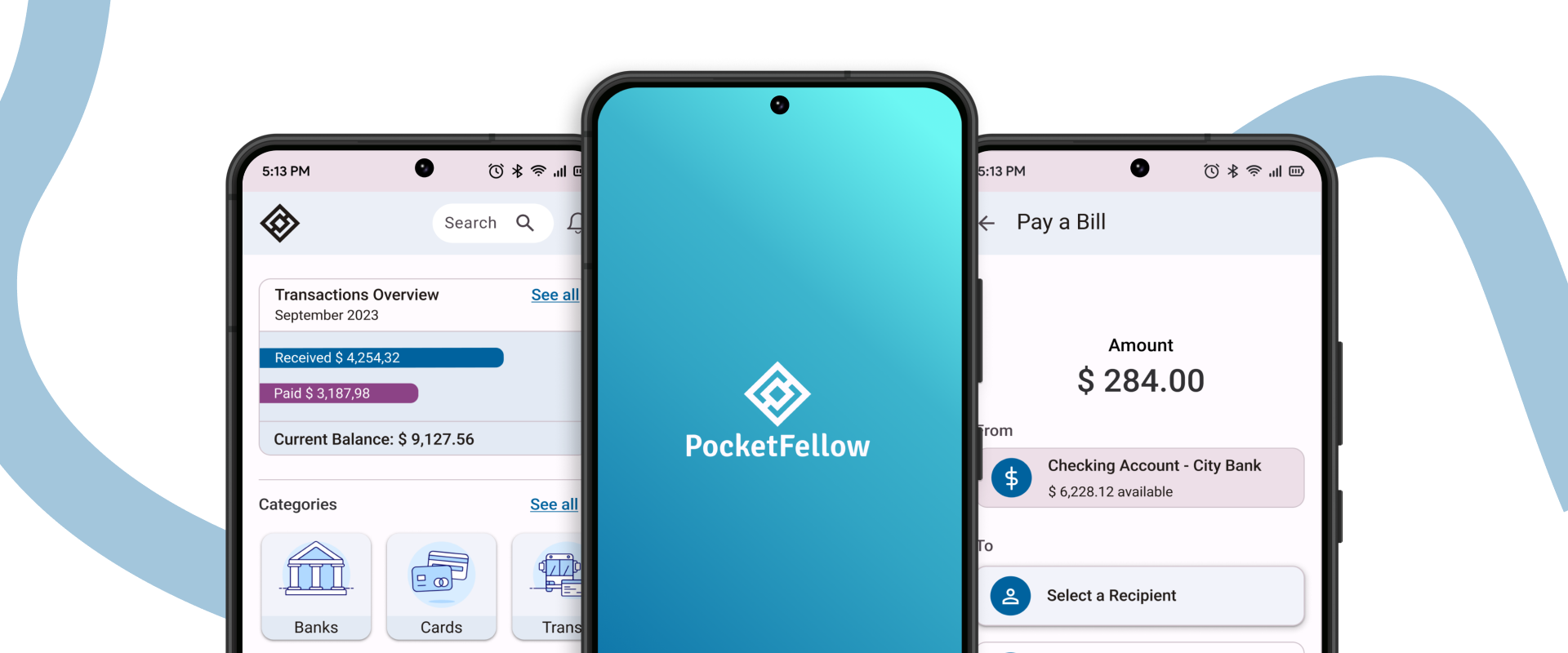
PocketFellow is a responsive web app designed to simplify and enhance the payment experience for people aged 55 and above.
My Role
Sole UX/UI Designer & UX Researcher
Tools
Pen & Paper | Figma | FigJam | Optimal Sort | Usability Hub | Microsoft Office | Google Workspace | Chat GPT | Notion | Slack | Zoom
Timeline
5 Months (Nov 2022 – April 2023)
Problem
The global population of people aged 55 and over is rapidly increasing. This aging population is also becoming more tech-savvy. At the same time, the lack of user-friendly and accessible options, coupled with concerns around security and privacy, has made it difficult for this demographic to adopt digital payment methods.
Solution
An app that allows anyone, but especially people aged 55 and over, to enjoy a simpler, safe and effective way to use technology as a tool to make payments, shopping online, store cards’ information (public transportation, loyalty cards, insurances, ID, etc.) and more.
Design Process
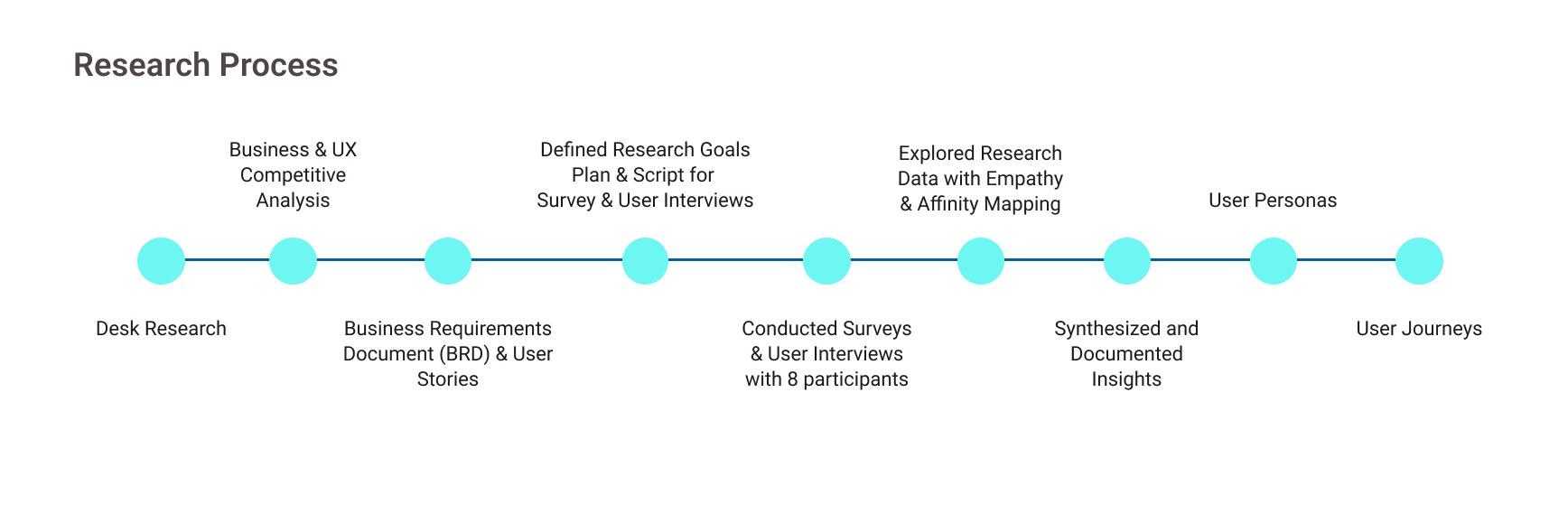
To design PocketFellow, I followed the double diamond design process, which for me works as a great strategy to bring structure to the problem-solution cycle and makes it easier to define problems and identify solutions.
I divided my game plan into four phases, so that it matched the main phases proposed by the double diamond: Discovery, Define, Develop, and Deliver.
1. Discovery
2. Define
3. Develop
4. Deliver
In this mainly research phase, my goal was to gather all necessary data to better understand and define the problem.
The first most important piece for me was to:
- understand better business objectives and users’ goals
- ensure that they were closely aligned.
Understanding the Market
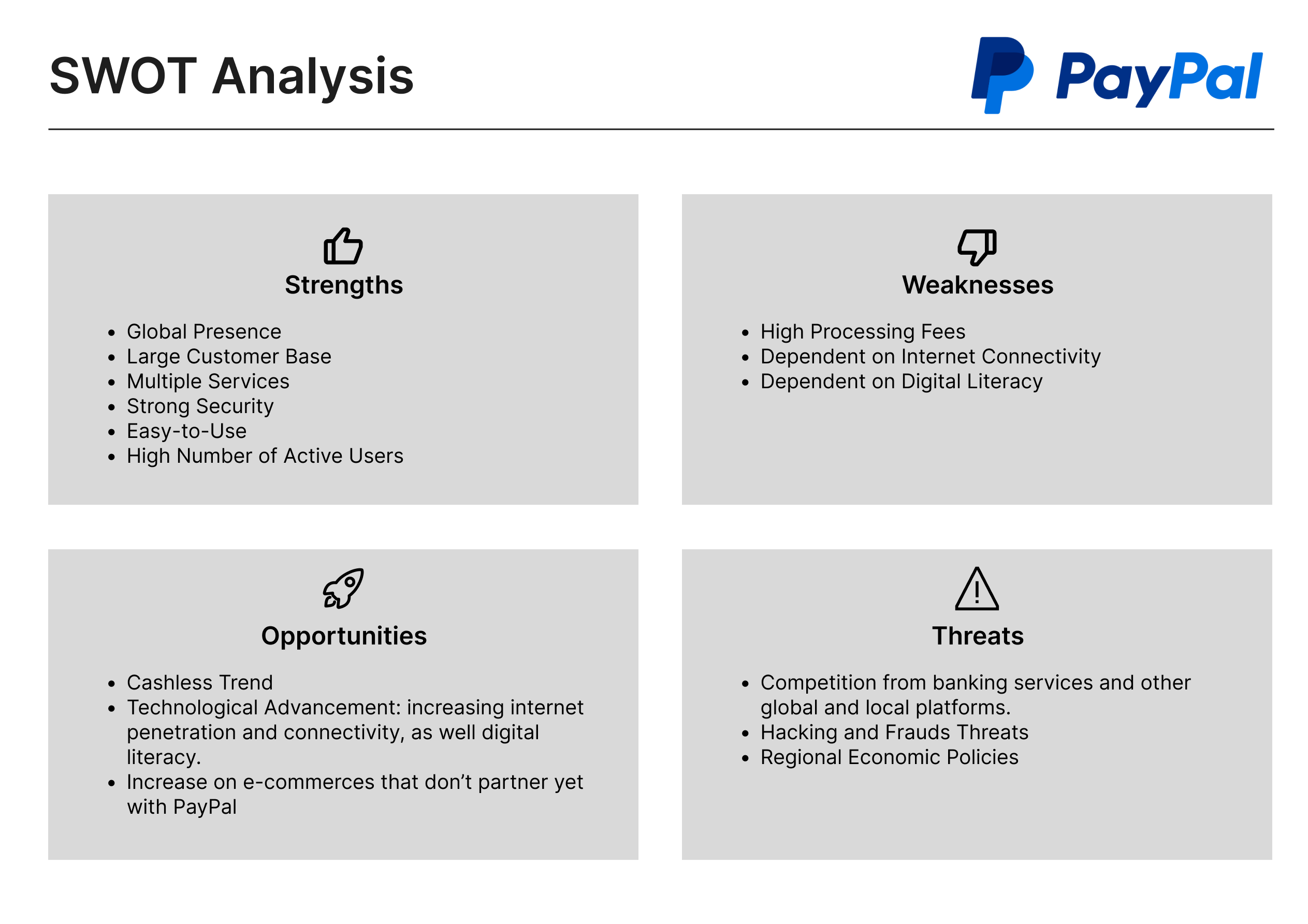
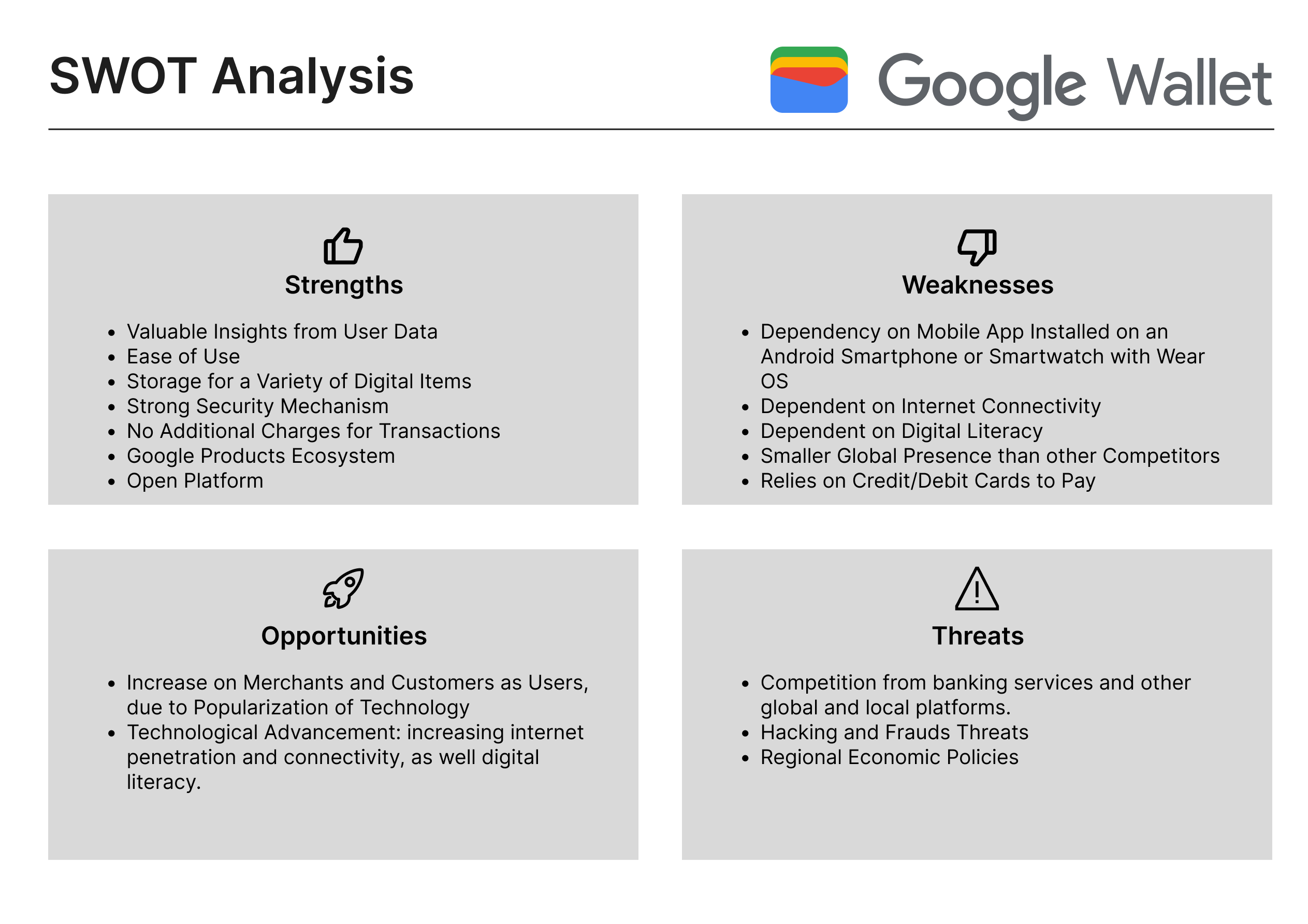
Competitive Analysis
I started with desk research, followed by conducting both a Business and UX Competitive Analysis on two big market players to better understand the competition and the experience offered by their products.
Risks & Opportunities
After the Competitive Analysis, I concluded that competitors are longer in the market, have higher investments, and are better known. Our app could face the risk of not standing out.
However, the competition’s products were developed with the general user in mind, and not specifically the older adult generation. This population is increasing and living longer, while they also increase their digital presence beyond social networks and searching engines.
Therefore, building a product with older adults as users in mind offers the chance to embrace a huge audience that has not been heavily targeted yet.
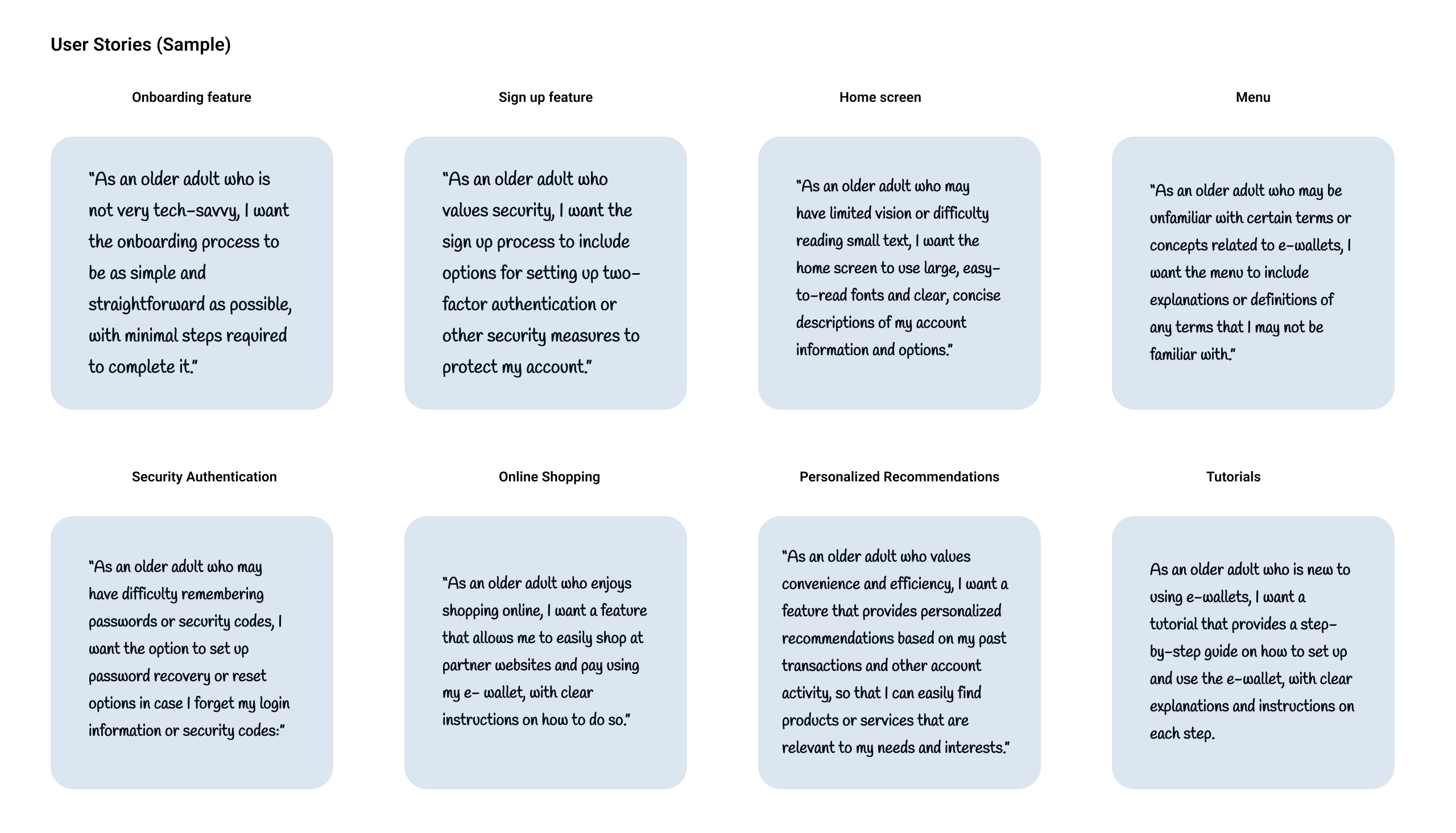
User Stories
With the understanding of the risks and opportunities for our product in the market, business requirements became clearer. With the intent to break down the requirements into small parts I created User Stories.
It helped me to get a better understanding of the features from the perspective of the people who desire them.
Understanding the User
User Interviews & Surveys
I planned, conducted, and analyzed data collected through user research with a total of 8 participants that aimed at understanding the target audience’s needs, preferences, and pain points. Research methods included online surveys, in-person and remote user interviews, and observations.
User Research Goals
- to better understand people’s initial behavior and attitude around technology and finances.
- documenting opinions and pain points on existing apps on the market.
- to determine tasks that users would like to complete and in which context.
- collecting data on users’ general attitudes about privacy and security, as well on what makes them feel safe online.
All data was carefully organized and arranged using FigJam, and later synthesized using Empathy & Affinity Mapping methods, which helped me to find significant overlaps of information and gather insights into user behavior and requirements.
Key Findings
- Concerns about Security: people want different levels of data privacy and safety.
- Uncomfortable technological experiences: usability tests will be a priority.
- Uninterested on managing investments: feature will be removed.
- Many users with reduced sight and low level of tech know-how: need a clear, intuitive UI.
- Paying a bill is the main task
- Easy Budgeting: they want a visual representation of incomes vs. expenditures.
User Personas
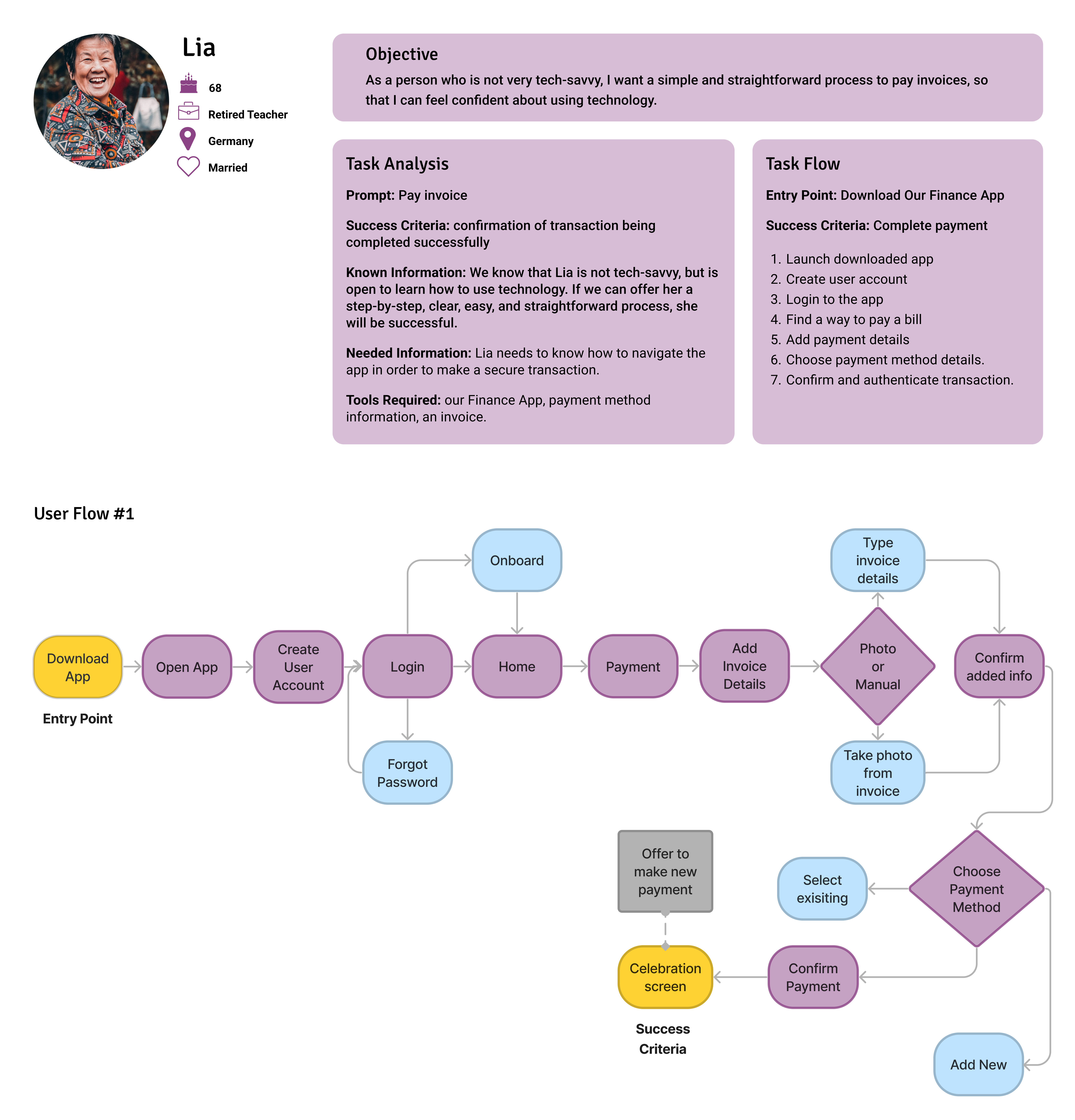
Based on the research findings, I created two core personas, to represent the target audience that I had identified: adults 55+ with different backgrounds and levels of tech know-how and particular needs.
Lia belongs to the group of people who is willing to try new digital tools, but often feels frustrated because it is complicated, and she ends up asking help to someone in the family. She would like to be able to manage her finances in her cellphone, but is also afraid of all the risks involved.
Lia
Primary Persona
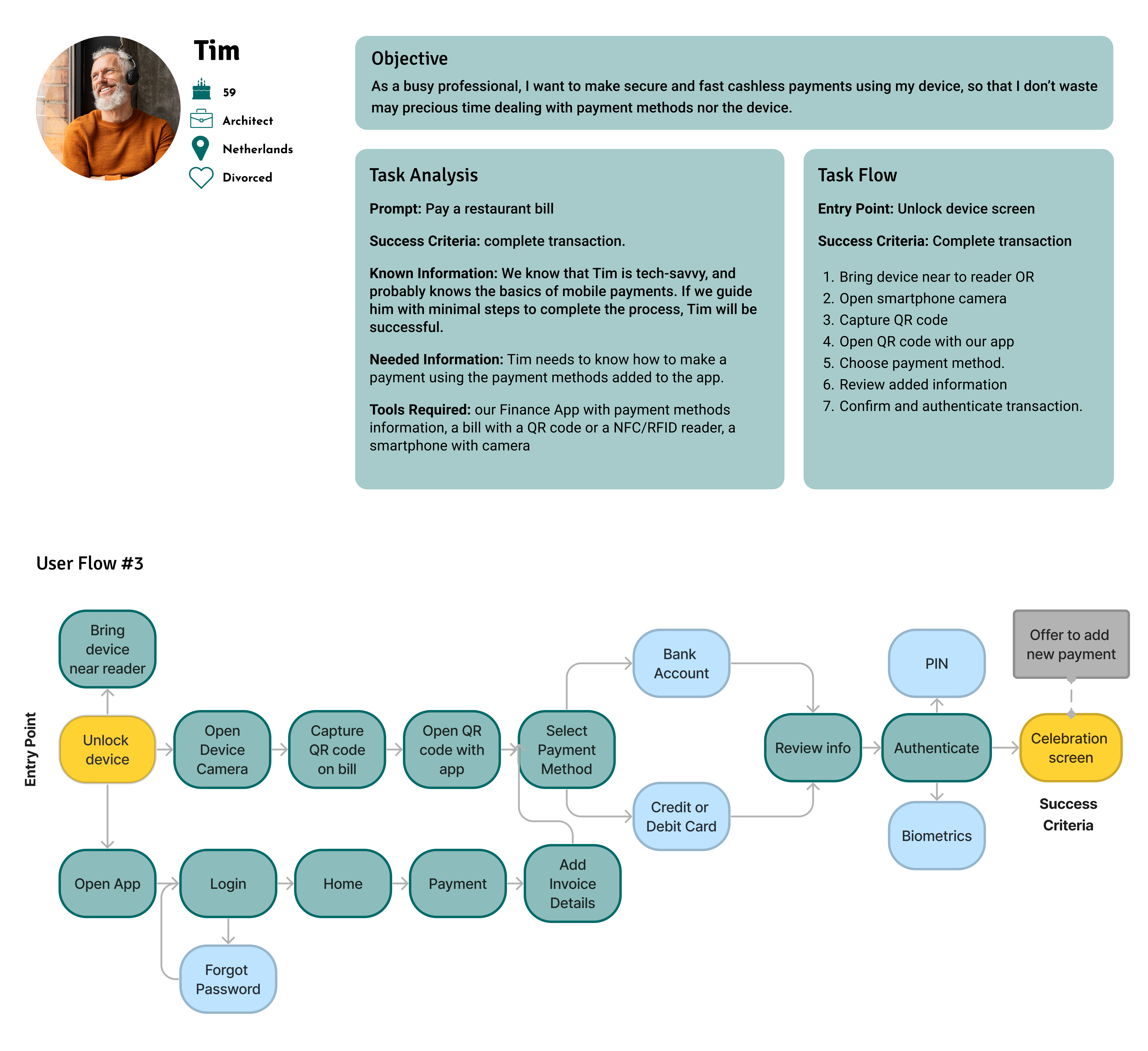
Tim represents the group of people who are already familiar with digital tools, which is part of their routine. However he would like to try tools that are more reliable, efficient and easy to use, as he is a busy professional without time to dedicate to understand how a new app works.
Tim
Secondary Persona


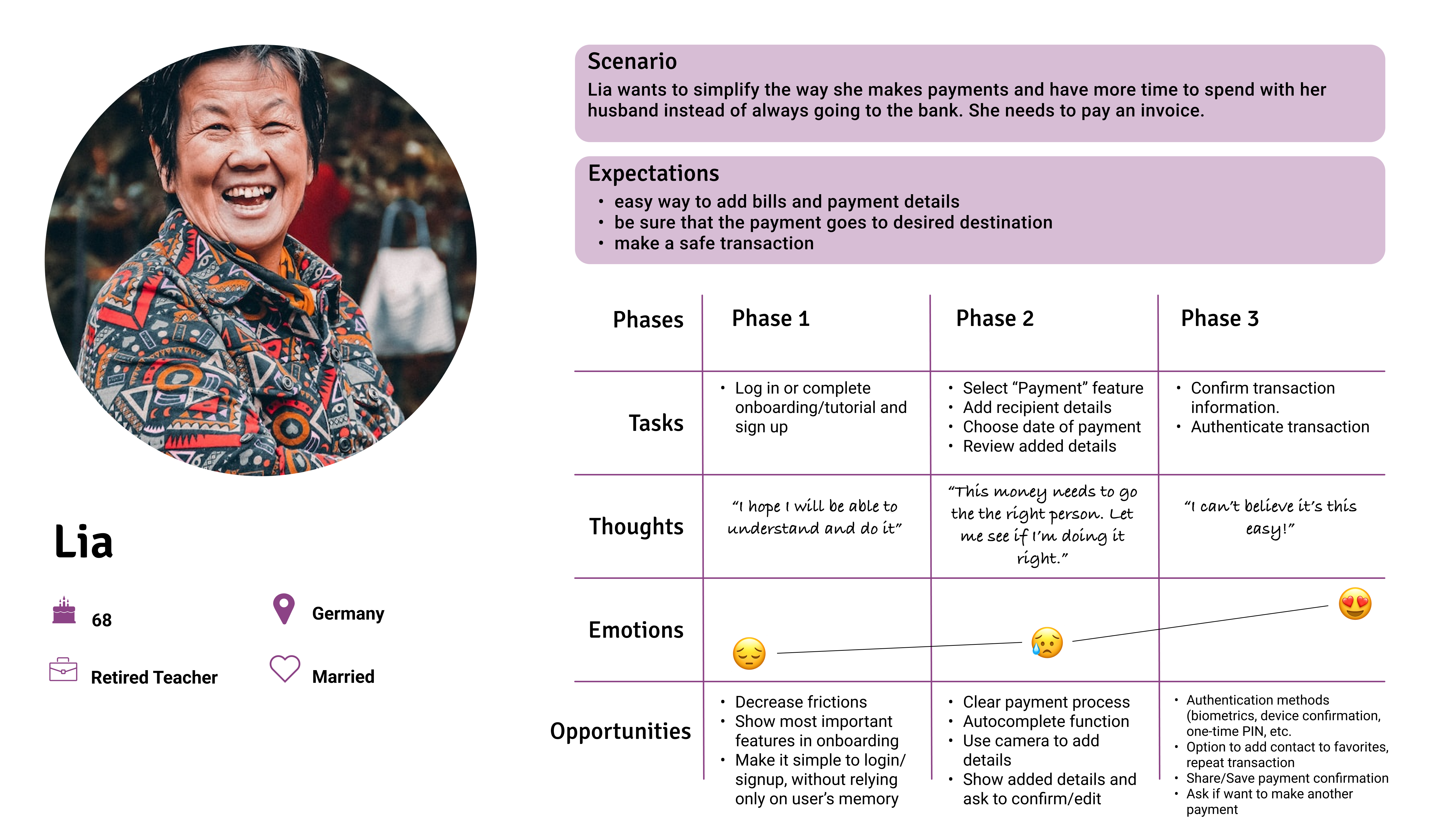
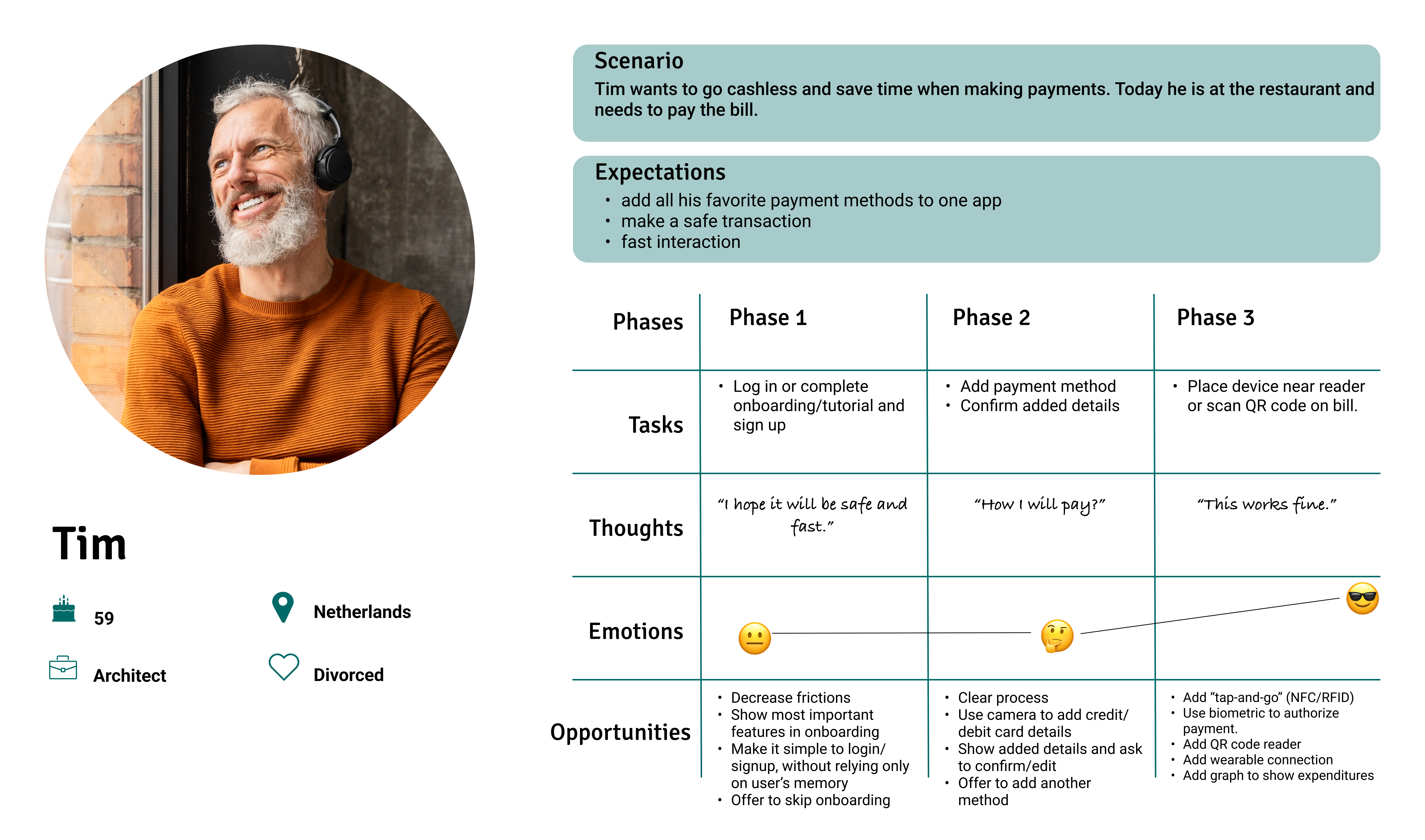
Task Analysis & User Flows
Keeping in mind the research findings, I narrowed down and prioritized features considering the main tasks the personas would like to complete using PocketFellow. I decided to focus on three main features to refine the project requirements.
Task analysis and user flows helped me to better understand, empathize and visualize how each persona would perform a task within the app.

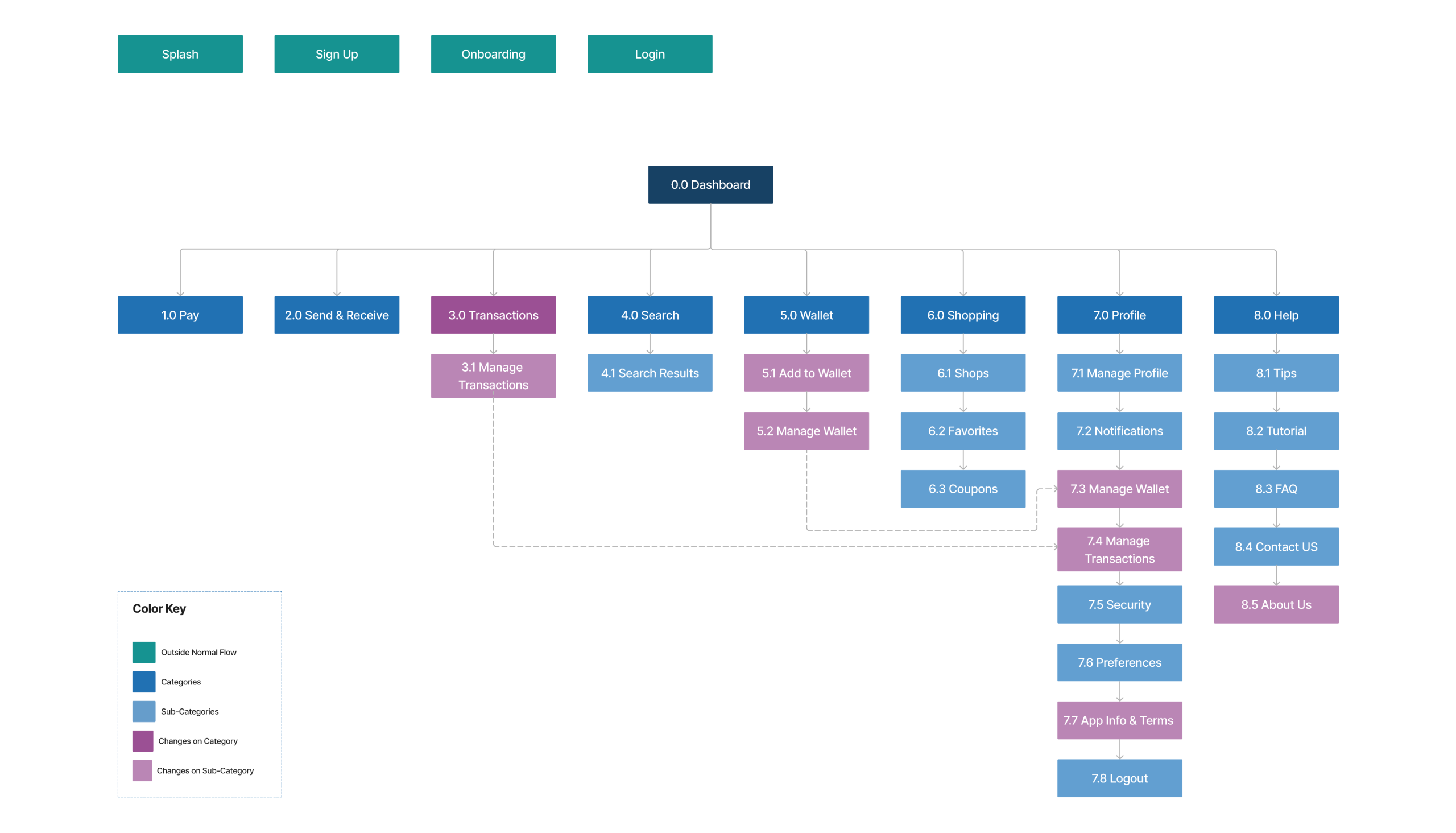
Information Architecture
Before starting to sketch on paper any solution, I started to look at the Information Architecture, in order to organize the information in a way that makes sense to users, and improves their experience.
I created a sitemap, based on the User Flows & Task Analysis previously created for my personas. I considered the various pages on the website/app and outlined it as diagram on FigJam.
To make sure that the decisions regarding the structure and organization of the information is clear and understandable to users, I conducted an online open card sorting on OptimalSort with 7 participants.
Card Sorting Takeaways
Confusing labeling: Some cards were confusing to participants.
Improvement: Updated sitemap with different wording and specifying a few features.
Confusing Grouping: “about” was placed by some participants in a category called “About us” or “Company Profile”.
Improvement: Update the “App Info” nomenclature and added an “About Us” card.
Wireframing & Prototyping
With a clear idea about the problem and a sitemap with organized and connected content, I began sketching some solutions using pen and paper.
I always start low fi to help me get my ideas out fast and get early feedback. Even if I created wireframes for both desktop and mobile features, I decided to focus on the mobile version for this round of iteration.
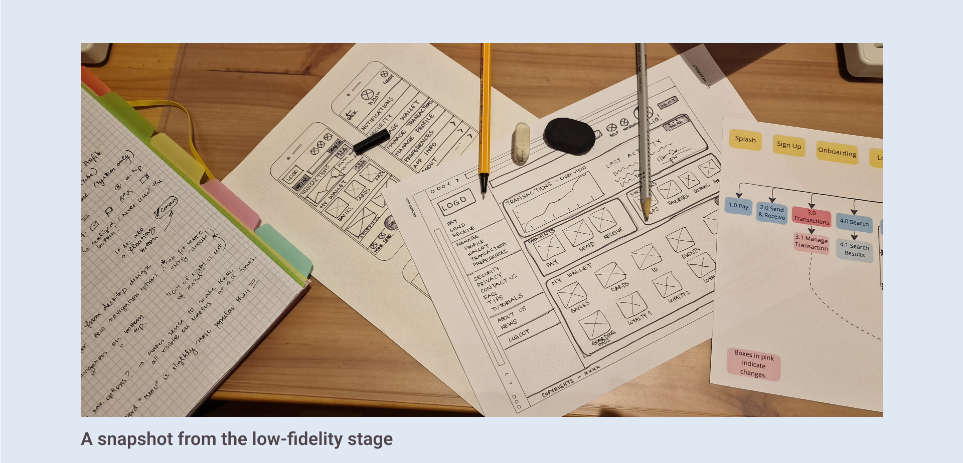
I used Figma to review the low fi sketches and create mid-fidelity wireframes and a clickable prototype, so that I could start testing the solution with potential users before moving to more detailed high-fidelity wireframes.

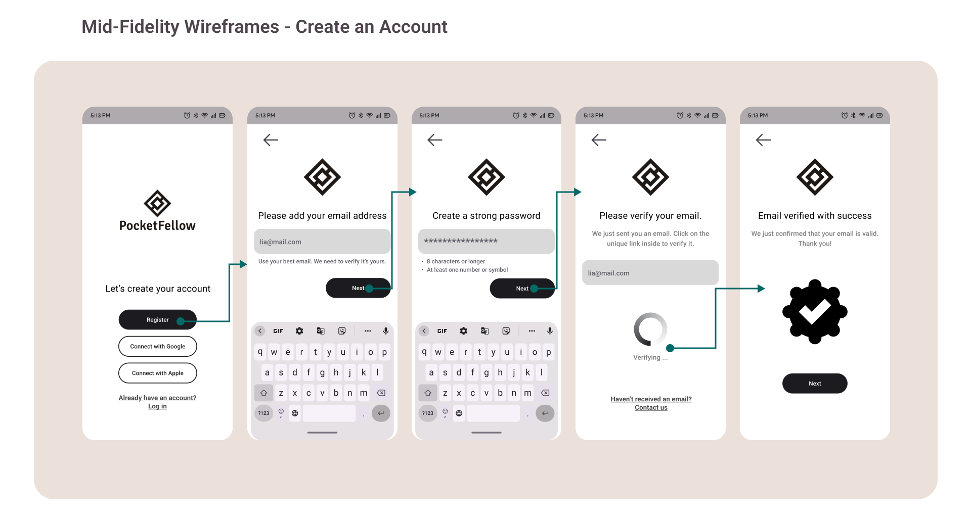
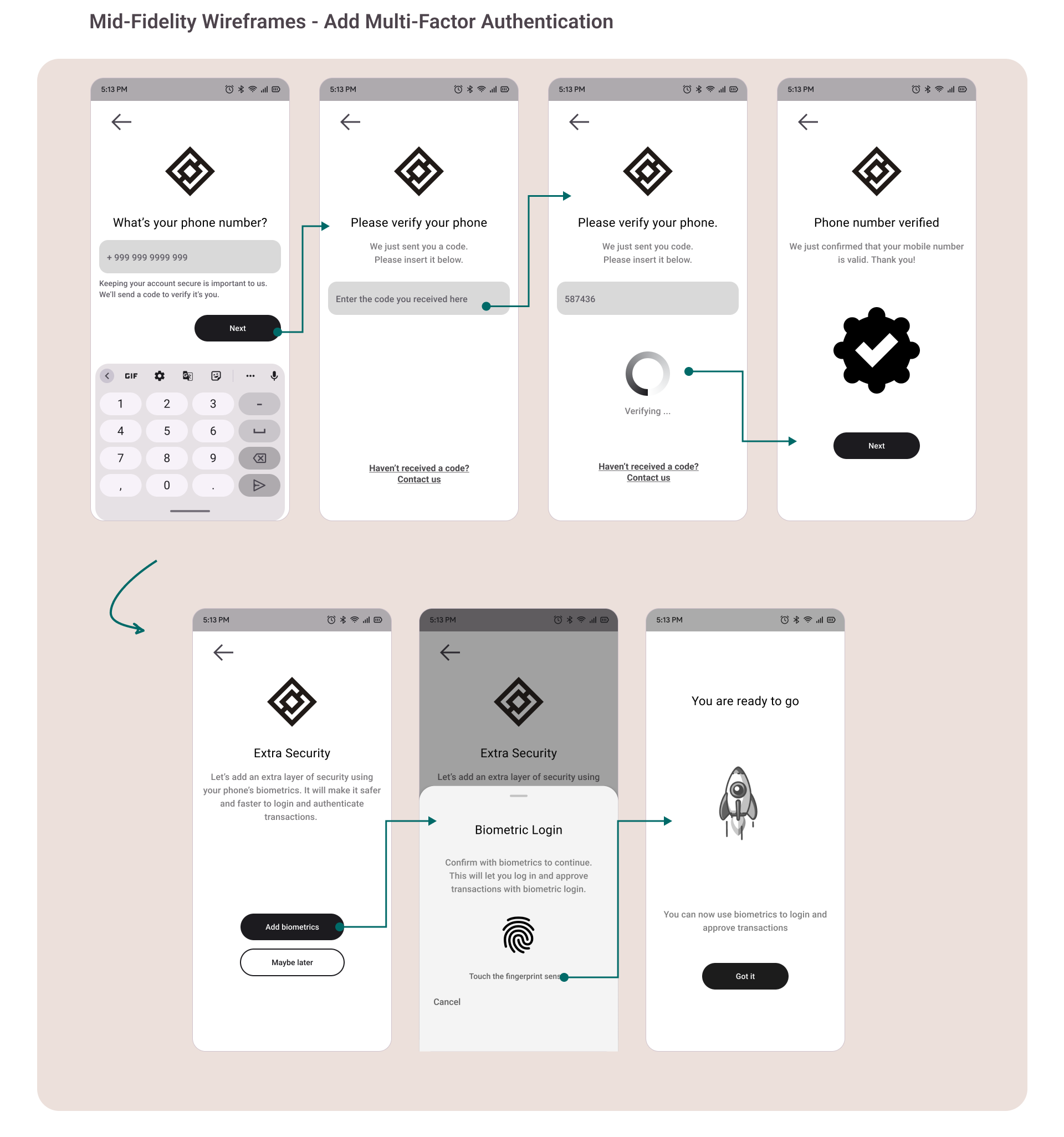
During this creative process, I understood the problem further, and found creative ways to solve them, i.e., to remove some screens to ease the flow, ensuring that texts can be easily read by users with reduced sight, and improving the visual hierarchy.
User Testing
In order to validate my mid-fidelity prototype as a solution that responds to the users’ needs and goals, I planned, scripted and conducted remote usability tests with 6 participants from a variety of nationalities using the Think-Aloud technique. All sessions were video recorded.
I also prepared and conducted online preference tests with 39 participants using Usability Hub.
Errors were measured using Jakob Nielsen’s scale, and satisfaction using Single Easy Question 7-point rating scale.
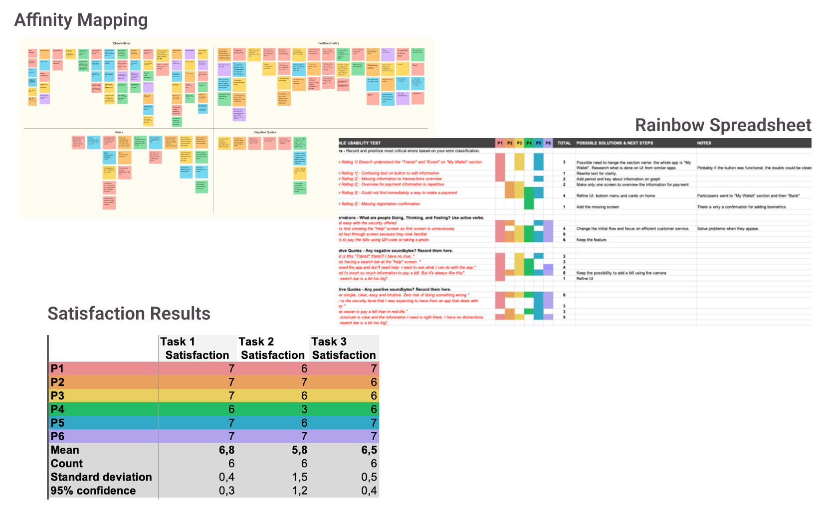
Key Findings
Usability and preference testing results showed that participants were able to navigate easily. Many participants confirmed that the app was simple and intuitive. The results suggested that some elements needed honing. In some cases, it was not immediately obvious to participants where to begin to complete the given tasks. Once they found the entry points, tasks were completed without difficulties.
I identified 5 issues, mainly on the home screen and payment flow. Fixing the issues helped the experience to become more enjoyable.
Issue 1: Navigation Bar
Participants could not immediately find a way to pay a bill.
Suggested Changes: Improve hierarchy on interface, especially navigation bar.

Issue 2: Transactions Overview Graph
Participants were not able to make sense of the presented information.
Suggested Changes: Improve clarity.
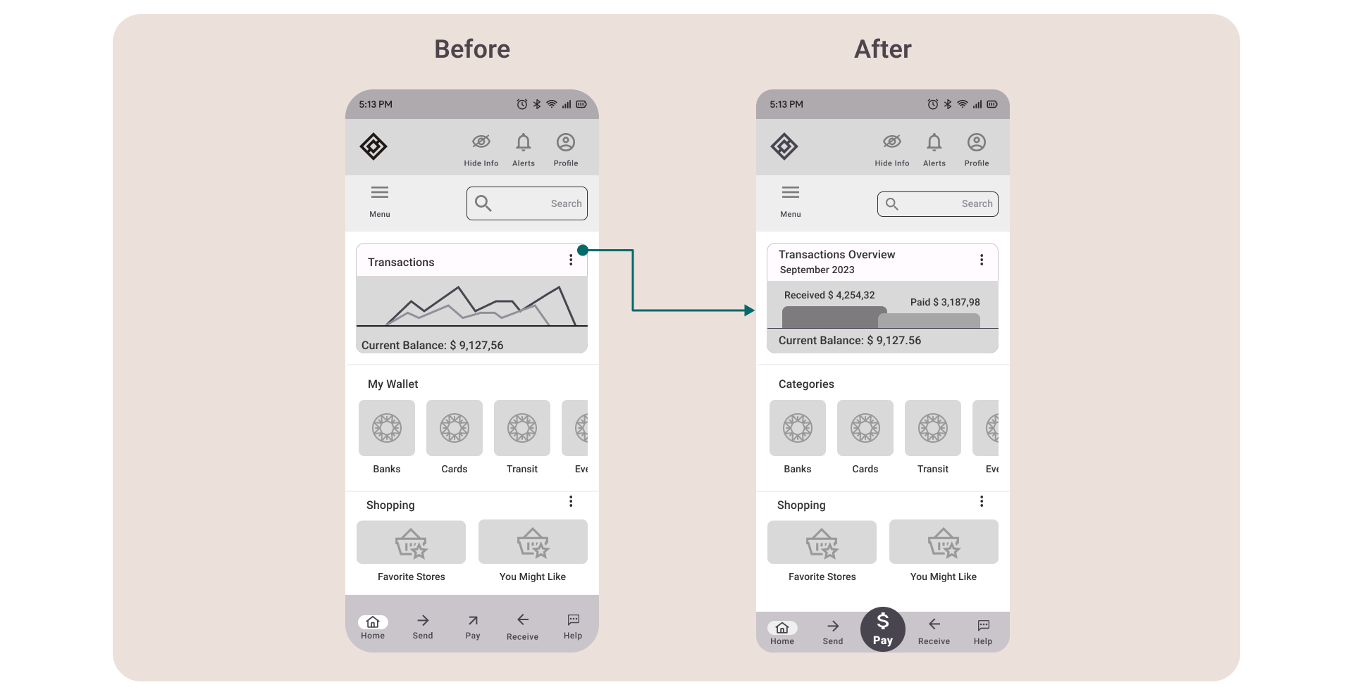
Issue 3: Confusing Copy
Participants could not understand the connection between elements under the “My Wallet” section.
Suggested Changes: Review section’s copy, considering that the whole app acts as a “wallet”.

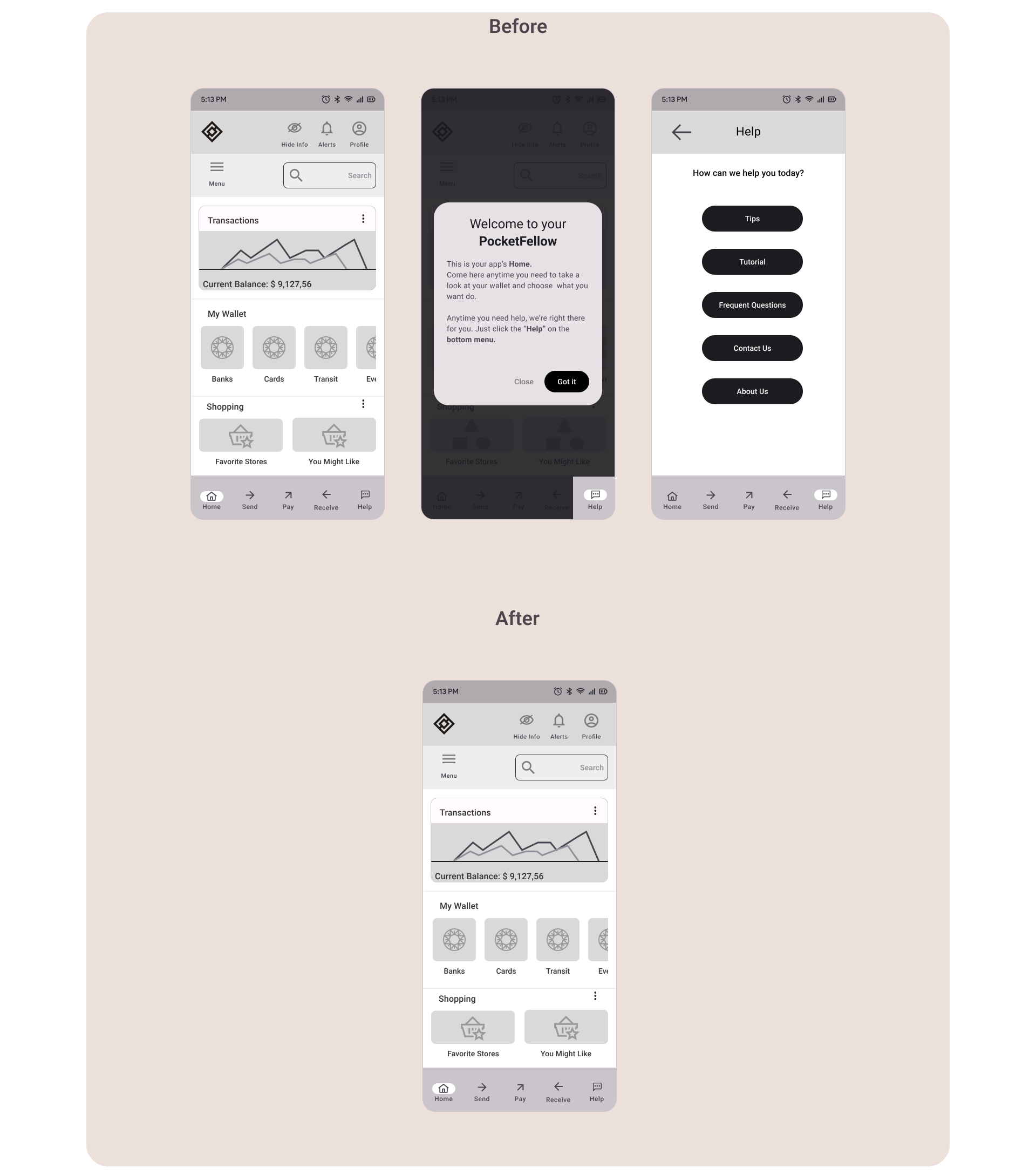
Issue 4: First Login: Help and Onboarding Screens
Participants affirmed that seeing the Help screen and the onboarding modals were unnecessary, and creates more confusion.
Suggested Changes: Change the initial flow and take users from login direct to the home screen. Focus on offering an efficient customer service to help users.
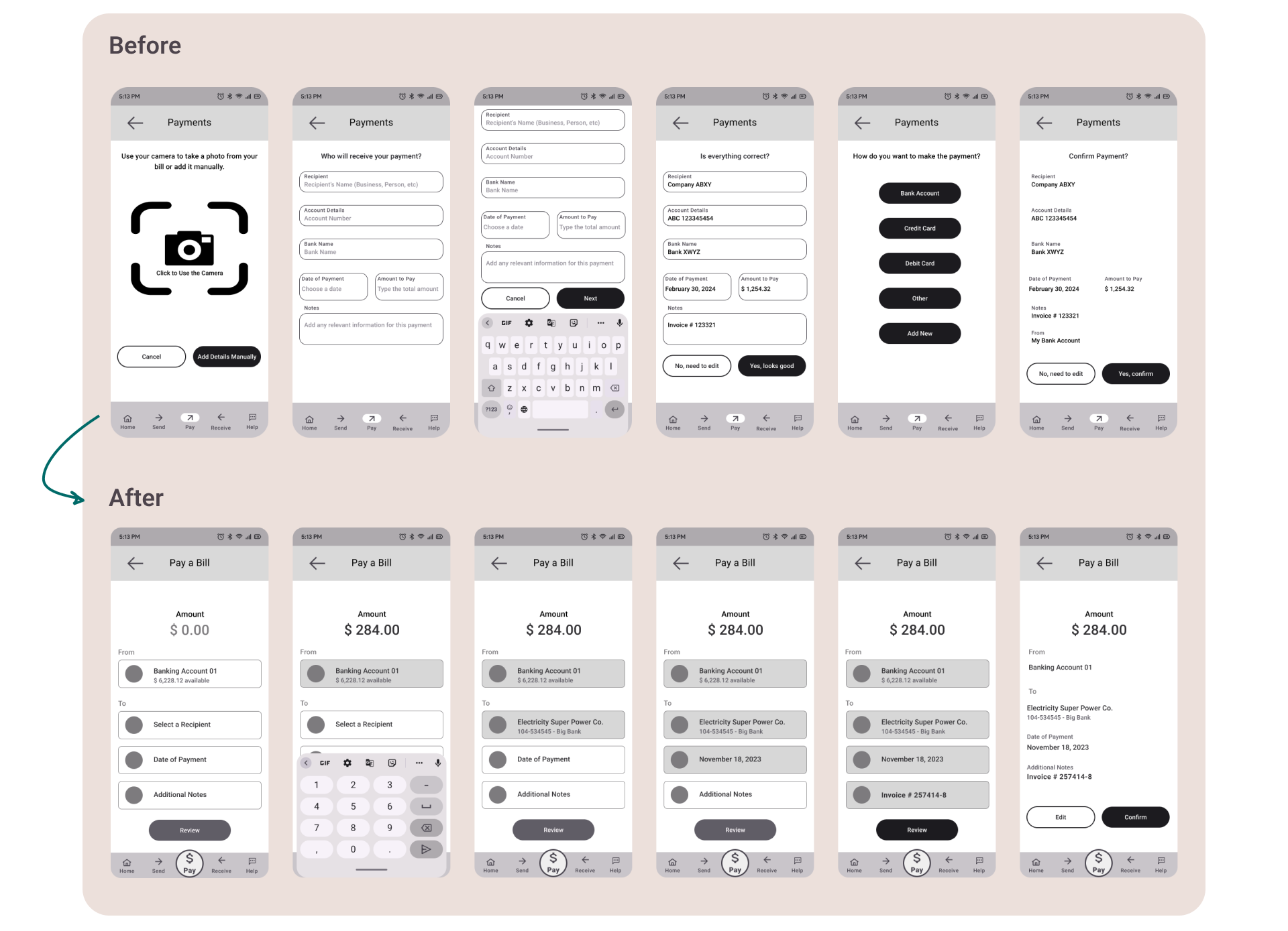
Issue 5: Inserting Payment Information
Participants felt frustrated when adding manually details to pay an invoice.
Suggested Changes:
1. Split the form into more screens and add visual clues for status to reduce cognitive overload.
2. Keep the feature of making payments using the camera.
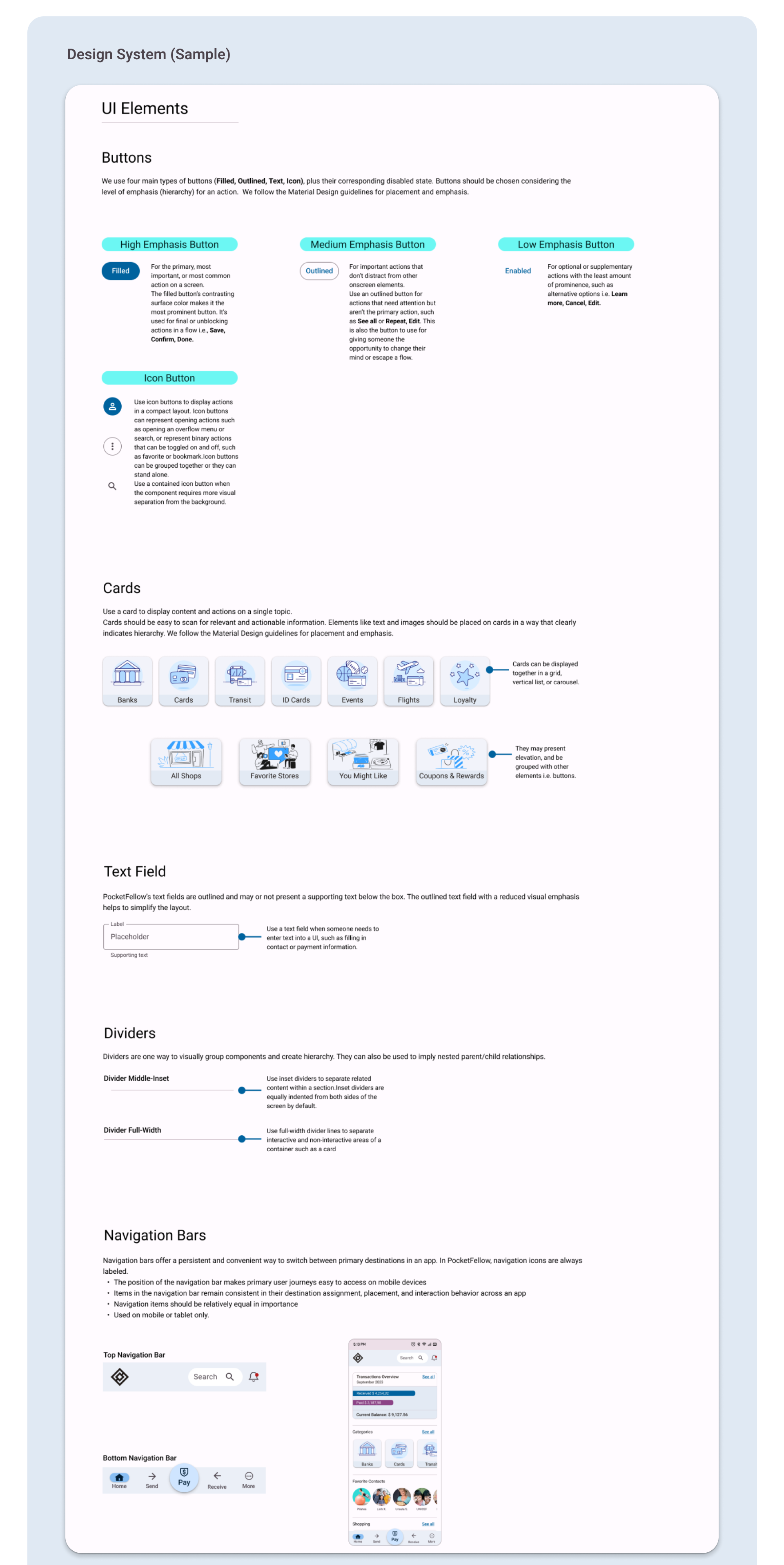
Refining the Solution
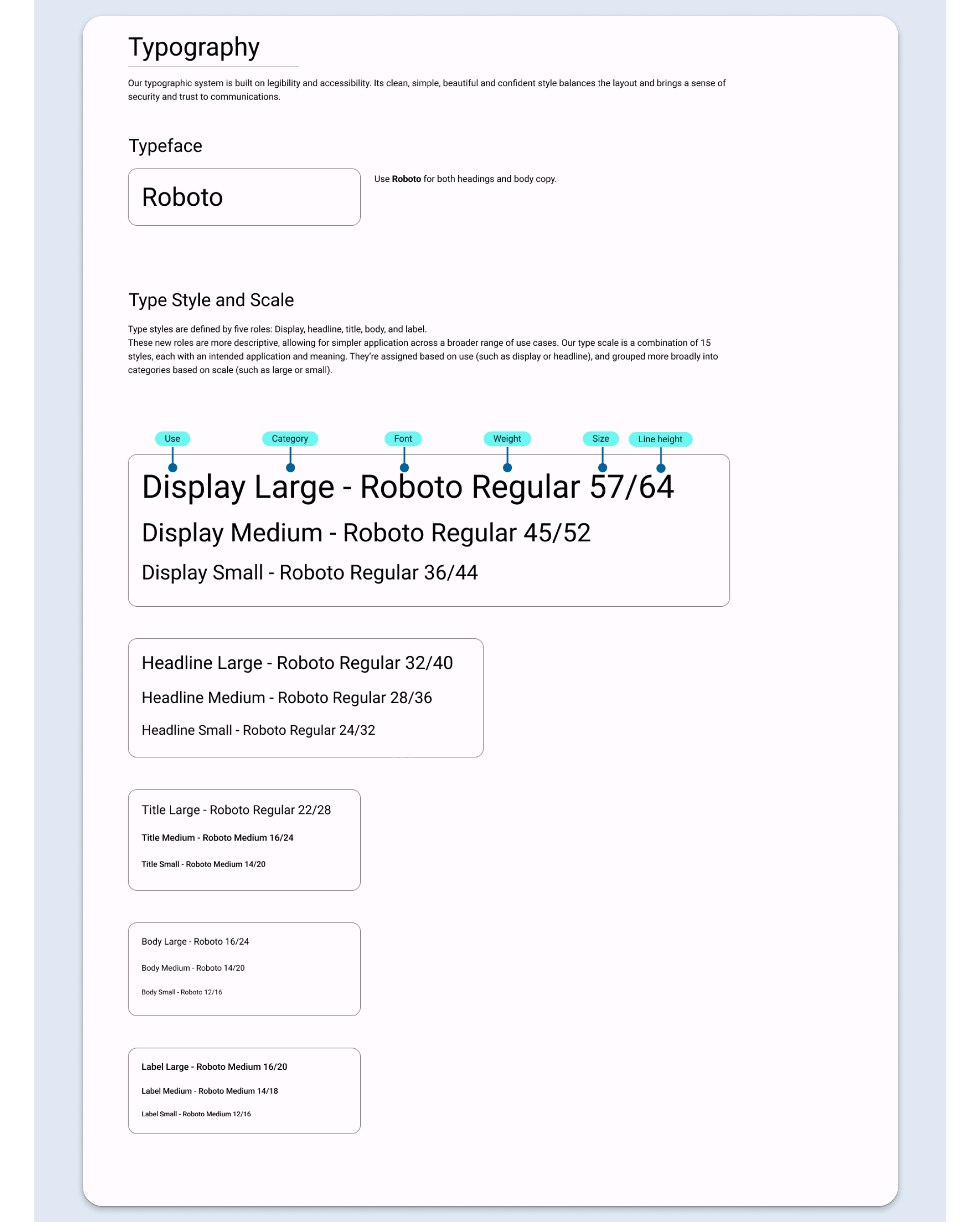
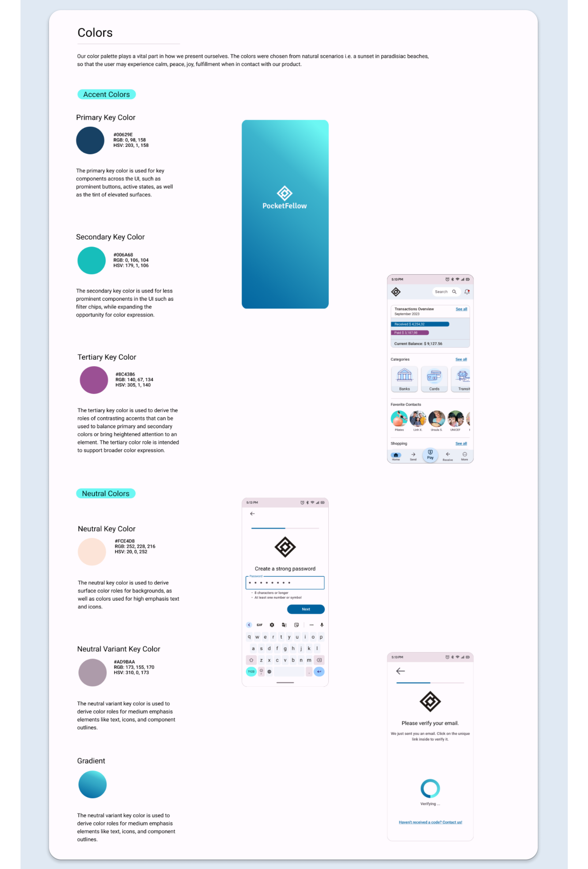
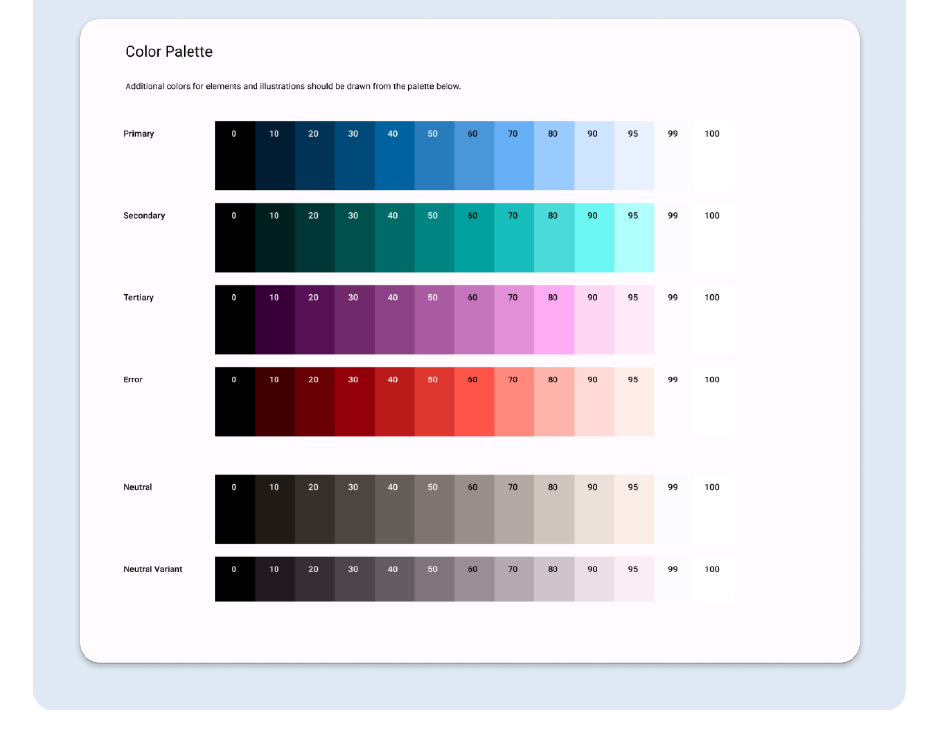
Once the improvements from testing were implemented, I explored the visual aspects of the app’s interface. I created initially a Style Guide, and based on this, a Design System, with the purpose of
- increasing productivity with standardized decisions
- ensuring the visual consistency of the application with the brand also in the future.
- communicating with developers and assist them when recreating the designs using code
Polishing Up the Design
To organize the layout of each screen on PocketFellow in a more logical and navigable way, I applied Gestalt Laws and Principles of Design to the app’s design.
I also reached out to 04 colleagues UX Designers for peer feedback. I analyzed and decided what to implement, and I iterated on the interface.
Finally, I ran an accessibility analysis and iterated to confirm the design to WCGA accessibility standards, to guarantee that the app was accessible to users with disabilities.
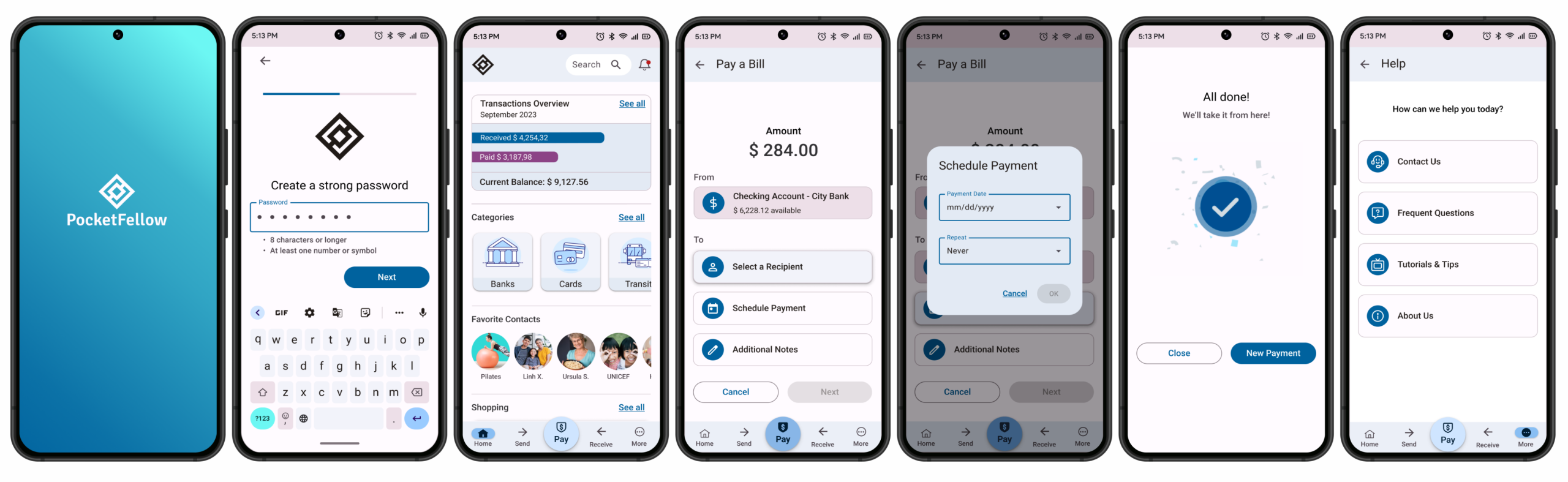
In this final phase, I delivered the current prototype of PocketFellow. It’s focused on users’ needs and goals, and comprehends:
- Splash and Introduction Screens
- A way to sign-up and login
- A home screen
- Navigation menus
- A safe way to authenticate a transaction: two-factor authentication and biometrics
- A feature that allows users to make payments
Next Steps
Looking forward, I plan to
- conduct more usability tests.
- continue developing PocketFellow in all of it features.
- develop its desktop version.
- dark interface option.
Learnings
As the sole UX Designer for the project from start to finish, even if I’ve faced some challenges, it was an extremely enriching and exciting experience.
Some lessons learned from this project include the impact of user research and testing, especially when designing for an audience to which I don’t belong.
Through this project I’ve gained insights into the importance of clear language, intuitive navigation, and striking the right balance of providing enough information without overwhelming users.
Additionally, it highlighted the significance of designing for accessibility and inclusivity.
Lastly, I learned to prioritize tasks and make efficient use of time to ensure that the project was delivered on time.
I am looking forward to continue improving this project, and create a great experience for its users.
Thank you for taking the time to check out my work!
