Case Study :
UX Design
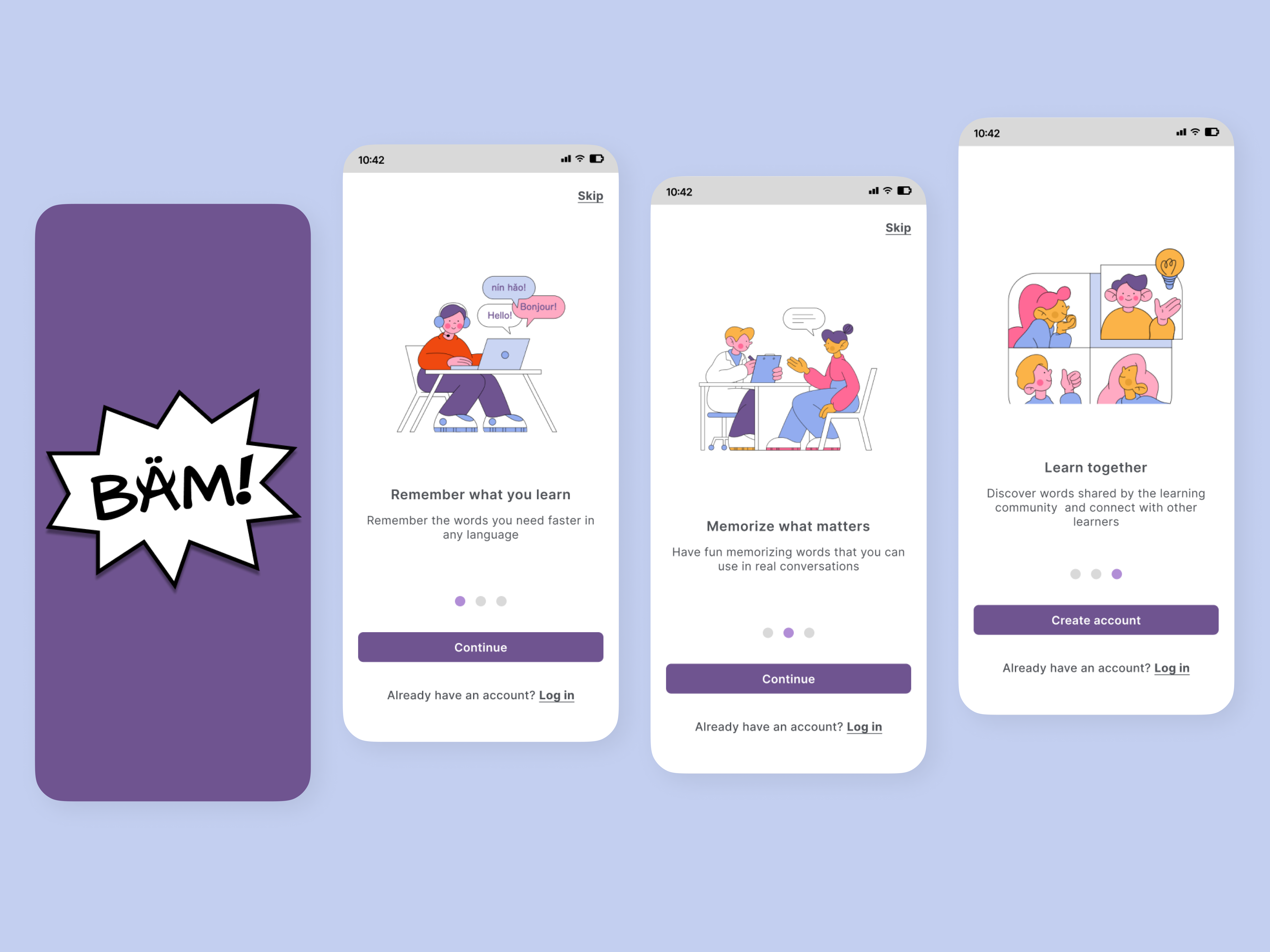
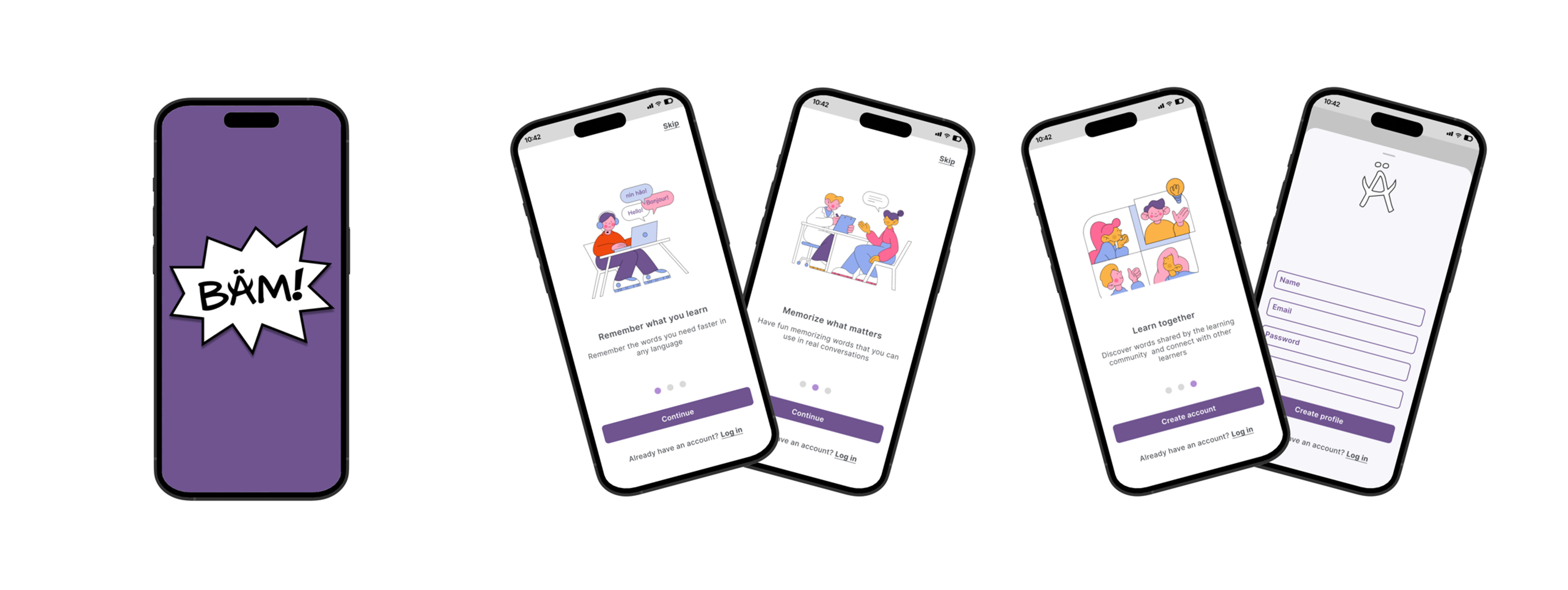
BÄM is a language learning app that aims to empower adult migrants to learn new vocabulary and better integrate themselves into their new communities.
Goal
Apply the design thinking methodology to create an app that met the needs of the target audience and provided a fun and effective way for them to improve their language skills. It should be delivered as low-fidelity clickable prototype.
Target Audience
Adult immigrants seeking to improve their language skills in order to more fully participate in their new communities.
Key Features
- Custom vocabulary decks: Users can create their own decks of words and phrases to study and repeat or browse and study decks created by other users in the BÄM community.
- Community connections: BÄM encourages users to connect with each other and share their progress, offering a sense of connection and support for learners.
- Progress tracking: Users can see their progress and set goals for themselves, helping them stay motivated and on track with their learning.
Design Process & Deliverables
To design BÄM, I followed the design thinking methodology. My goal was to create an app that is aligned to how users think, feel and behave in the context of learning a new language.
1. Competitor Research
2. User Research
3. User Persona
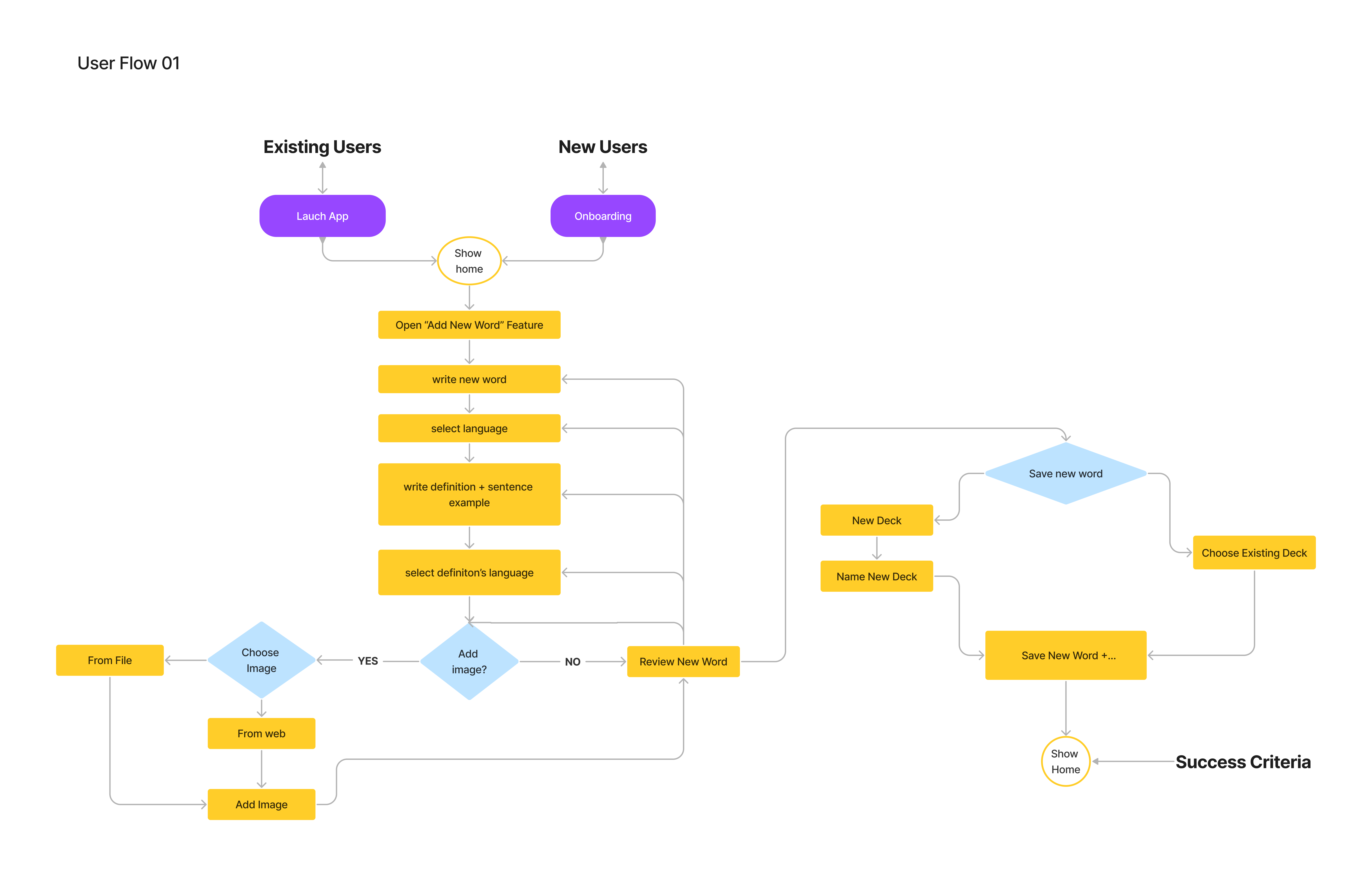
4. User Flows & Task Analyses
5. Wireframing & Prototyping
6. Usability Testing
1. Understanding the Competition
During my early research for vocabulary apps, I discovered a wide range of products for learning and practicing vocabulary. I chose the following apps to conduct an informal Competitive Analysis.
Insights Competitive Analysis
Researching these competitors, provided me with understanding on the positive and negative aspects from the features and experience offered currently by competitors. I identify also how our solution could capture a market opportunity by offering:
- A feature that allows users to add custom vocabulary and create their own decks
- A feature that allows users to share their own decks with the community and use decks created by others. Members in the community would be able to curate and rate the content to assure quality.
- A feature that allows to easily add image to card from various sources (camera, gallery, website, etc).
- An easy and fun learning experience.
2. Understanding the User
I conducted User Interviews with 5 adult immigrants. Notes were combined and summarized into three categories: doing, thinking and feeling.
User Research Findings
• Users feel frustrated while learning a new language when they cannot
remember the words that they have gone through many times.
• Users learn better by having new words in a certain context.
• Users feel happy and rewarded when then see their progress and remember words learned.
3. Proto Persona & User Stories
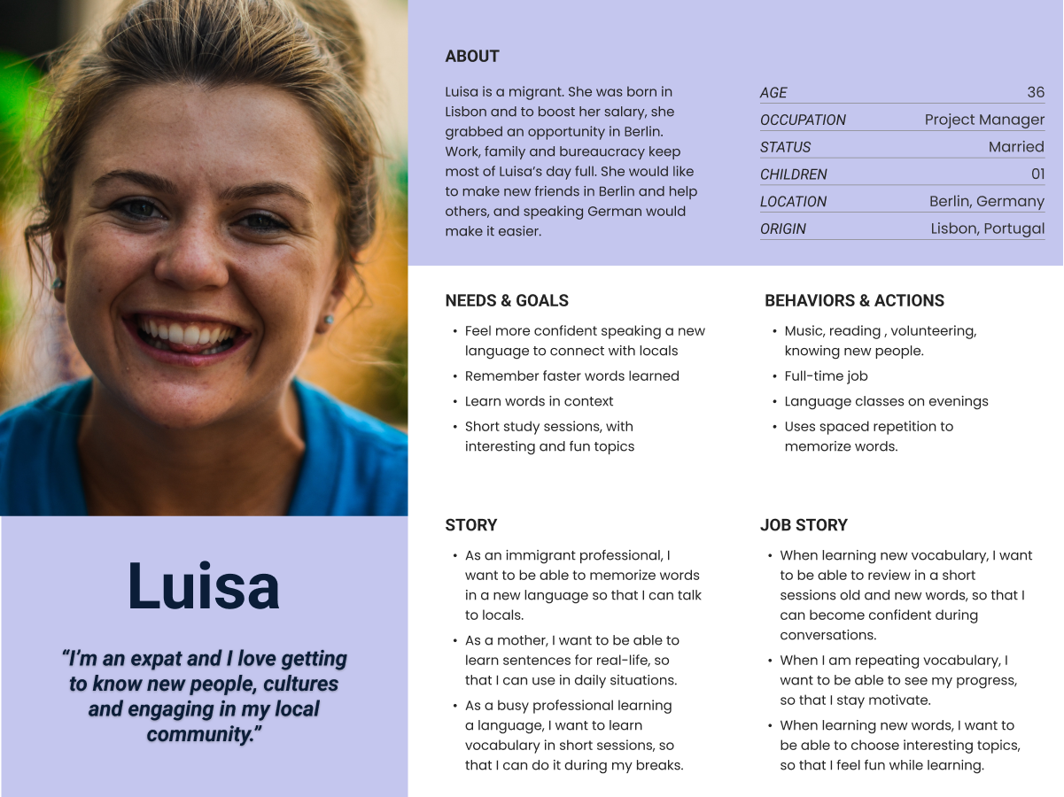
Due to the limited time and resources for this project, I was only able to develop a Proto- Persona. It was based on the thoughts and feelings of the interview participants.
Problem & Hypothesis Statements
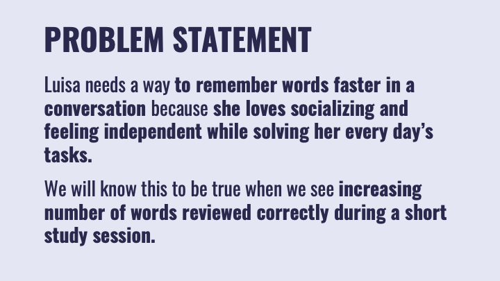
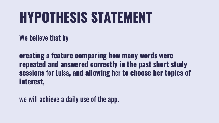
Based on Luisa’s User & Job Stories, I restated the Challenge, with a Problem Statement and developed a Hypothesis Statement for a possible solution.
5. Low Fidelity Wireframes & Prototype
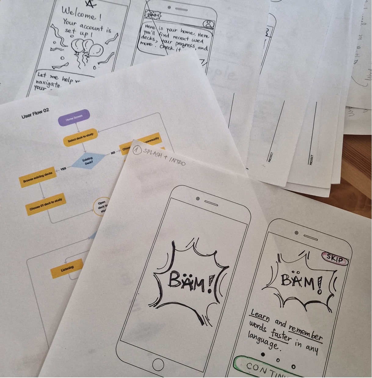
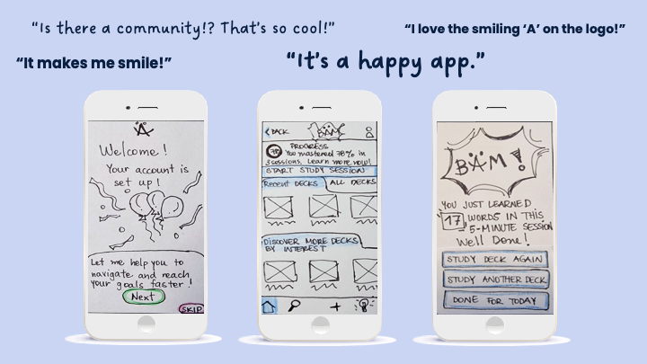
After exploring the problem, conducting interviews, creating a proto-persona and outlined tasks and lows necessary to create an enjoyable learning experience, I started sketching wireframes on paper to explore ideas.
These low-fidelity wireframes received digital interactions on Marvel, so that users could interact with the prototype and test it.
6. Usability Testing
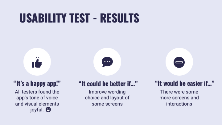
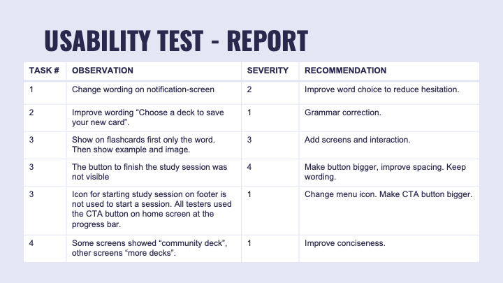
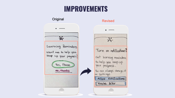
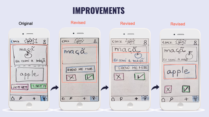
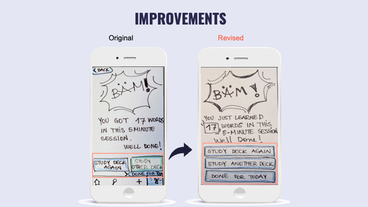
I planned and conducted usability testing with 03 participants to ensure the app was intuitive and easy to use. I summarized the findings in a Usability Test Report, rated errors and prepared myself to implement critical revisions to the prototype.
Next
Even though this project required only low fidelity wireframes and prototype, I started working on some high-fidelity wireframes for it, based on feedback from users.
There are several potential areas for future development for BÄM. These include adding more interactive features to the app, such as games or interactive lessons, and expanding the community features to include more opportunities for users to connect and share their progress.
I plan on completing the MVP with high-fidelity wireframes and prototype. Additionally, I would like to continue gathering user feedback and using this to guide further iterations and improvements to the app.
